Thursday, 27 May 2010
the end
Front Cover
And have also decided to call it the 'Long Live Fashion Issue' - I think this is quite ironic as I am talking about the death of fashion, yet how it still seems to hang over us...
The photograph I chose for the front cover is the image that I find most striking and eye-catching, but it also has a 'haunted' look about it which I think will give the reader an idea of what it is all about.
Photoshoot no.3


 I think the positions of the model work well and layering the images also went well as they do seem do show an idea of 'specters', 'ghosts', and 'shadows'. However, there were a few problems along the way. When making a cutout of the body to exclude the background, a line appeared around the cutout which when layered looked even more prominent. Therefore for certain images I will not use the cutouts although the background will be layered as well as the figure. One of the main problems I have had with manipulating the images is that as I do not have Photoshop at home, I have been using two online programs (photoshop.com and fotoflexer.com) and these tend to not be as reliable or sufficient in terms of time management. It takes a while to upload photos and occasionally freeze which means what I am working on will have been lost and I would have to start again. So this is something to look into for any future projects - GET PHOTOSHOP!
Friday, 21 May 2010
Bookbinding
Although I want to use tracing paper to print some of the photographs onto, I think that with the photograms, the glossy photo paper gives them such a bold and eye-catching effect that I am considering having different qualities of paper in the magazine. I also found some A1 sheets of paper today that feel something like a mix of tracing paper and newsprint which would be perfect for the magazine because some pages look better when you cannot see through to the next page. Also, placing a photograph printed onto tracing paper and then placed over a photogram printed on glossy paper looks interesting...
Photograms
Influence of Freud
In this essay, Freud tells us about his friends view that everything that is beautiful is doomed to death and therefore he felt no joy in it;
"...all this beauty was fated to extinction, that it would vanish when winter came, like all human beauty and all the beauty and splendour that men have created or may create."
However, Freud's view was that just because something beautiful may only last a short time, makes it no less valuable an experience; in the contrary, it makes it all the more special because we must not take it for granted and must hold dear every moment that we have with it.
I felt that this really could relate to fashion because in a sense it is so ephemeral. Styles and trends come in and out of fashion so fast that there is little time to appreciate what is 'in' at the moment, but that certainly does not mean that we do not embrace the 'current' fashion collections, for sure we can see that by the worth magazines still have in this age where fashion seems to either be repeating itself or constantly be looking for something new. In an interview my tutor, Susan Postlethwaite, did with Tracey Neuls in The Measure, she thought about the idea of fashion being over because 'it is so self-referential now, fashion repeats itself so quickly,' and I think it is true that fashion has become self-referential now, but this seems to be an age where more than ever fashion has become one of the most important aspects of culture. This may be because it is so readily available now, but that is another topic. It just seems to me that season collections temporal limitations does effect its value.
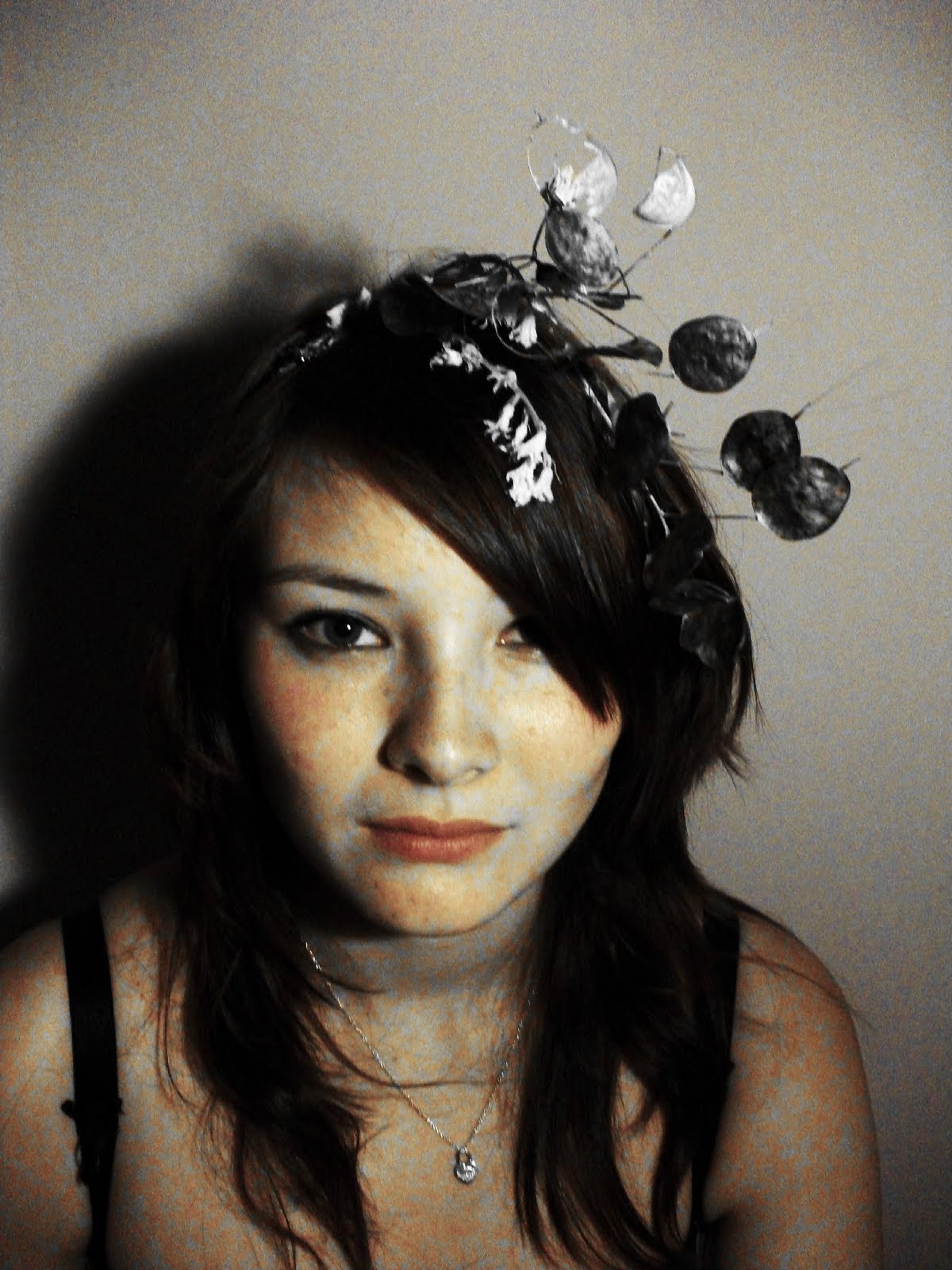
Considering all of this, I decided to use the idea of flowers in showing the 'death' of something beautiful. I picked some flowers and left them to die over a few days. It was interesting seeing how they drooped and became flaccid over time and shrunk too. Then I organised a photoshoot where the models wore the dead flowers in their hair:


Sunday, 16 May 2010
Crit No.3
- My FMP is effectively an homage to magazines and publications and my research file will become my magazine
- What will the contents be? photoshoots, interviews of foundation fashion students, editors letter
- The editors letter is not going to be written by me. So far, the letter from the editor of all the first issues of magazines I have looked at have set out who their audience is intended to be and what they are trying to do. I have photocopied and annotated these and highlighted parts that are relevant to my magazine and I think it would be a good idea to use these as the 'letter from the editor'
- Aside from doing the actual photoshoots, I need to investgate binding now; this is another area that has a relationship to fashion - exposed and raw edges and unfinished seams etc. I should visit the book arts course at Camberwell to get advice on this
Photoshoot no.2 experiment


This was an experiment for another photoshoot that I am going to do, combining two photographs so show two meanings or something hidden. I think the print works well with the combination, but I need to find a way to make the cut out neater.
Photoshoot no.1


Photography experiments.
I didn't use a model for these photos because I wanted to give the dresses a 'forgotten' and ghostly feel. I used these dresses because they were translucent so added to the atmosphere I wanted to create. I shone a light on them to create shadows of the dresses on the wall behind; I thought it was interesting how the shadows looked like more real dresses because the shadow had a similar quality to the translucency of the dress.
I converted some of th photographs into black and white and for others made the colours really muted to give a sense of the garments fading away.
Saturday, 8 May 2010
 I listened to Launching the Style Decade on Radio 4. It was a programme where Robert Elms investigates the start of iconic fashion magazine The Face and how at the time it was a radically new idea for a magazine. It was started by Nick Logan who wanted to create a magazine covering what he liked. It was art directed by Neville Brody;
"magazine layouts were precious, predictable and obsessed with perfect balance but then Brody came along and pulled it all apart"
The magazine layout becme as important as the stories themselves.
tutorial
- could use description of clothes instead of photograph to leave it open to audiences own interpretation - look at Sophie Calle
- I need to collect and reflect on the all the things I have read and then see how the collected quotes could become visual and how they will be useful in the creation of the magazine
- use light source for ghostly/shadow effect?
- I need to reconsider my calendar!
- physical qualities of the magazine need to be resolved soon so that I can visit the Digital Print Bureau - printing will take time!
The Concise Dictionary of Dress
The Concise Dictionary of Dress - trailer from Artangel on Vimeo.
This is the trailer for the Concise Dictionary of Dress Exhibition at Blythe House, which I visited last Wednesday, it just gives an idea of what the exhibition is about. What I found after visiting the exhibition is that rather than being a dictionary of dress, it was more about taking Adam Philips definitions and using the idea of dress to show these in 3 dimensions, therefore I am not sure if it was more about about the idea of dress or of the definitions. Although, the website (http://www.artangel.org.uk//projects/2010/the_concise_dictionary_of_dress/weekly_definition_armoured/armoured) says this was the purpose of the installation:
"Commissioned by Artangel, The Concise Dictionary of Dress re-describes clothing in terms of anxiety, wish and desire, as a series of definitions created by psychoanalyst Adam Phillips and accompanying installations designed and assembled by fashion curator Judith Clark."
However, although the concept and the message Clark and Philips were trying to send was slightly unclear to me, I thought the definitions were very interesting. It was quite thought-provoking the way all the definitions would seem to be true of a word and showed how one word can mean such different things in different contexts. I also thought that there were some clever links between the definitions and what type of dress was shown in correlation to that definition. It did seem as though Clark was literally showing Philips' definitions in 3 dimensions; his ideas had became physical objects.
I thought the location of the exhibition at Blythe House, which is the archive for the V&A, the Science Museum and the Natural History Museum, worked well because often going around the exhibition, you couldn't tell if something was being stored there or if it was actually a part of the installation.
I think this was useful to my project in that it showed me another way of realising a concept. I had the idea of a throw-away, ephemeral magazine and showing this literally using translucent paper to print the magazine on. It also held a relation to the conceptual designers I am looking at such as Viktor and Rolf, because the installation had meaning and was based on the concept of Philips' definitions.
Monday, 3 May 2010
Crit No. 2
Although the crit session definately brought more ideas to the table, I think I am now a little more confused about my project because some ideas don't seem to be relevant. But these are the criticisms and the new ideas which I got out of this crit:
- I'm moving too fast with the screen printing and testing with materials at the moment, because my concept still needs to be developed and strengthened so that I really know what needs to be done before I start producing 3D work.
- There is such a wide choice of fashion magazines today, and each title comes out periodically. Can each magazine really say something different? Or at least something different to a magazine which has been published previously? There are so many magazines that can you really look forward to buying next month's Another or i-D? Won't you have already seen or read about these ideas before? Or does fashion change so fast that each month there is something relevant and new to say about it? Or does fashion just repeat itself, in which case what would be the point of a magazine? These are all things I need to think about and investigate into further.
- I spoke before of the ephemeral and throwaway nature of magazines, yet they are still precious; they are such nice physical objects to own and I personally love getting a new issue each month. And although there are some pages which I would be happy to discard, these magazines always encapsulate key moments in fashion history. Maybe this is something to include in my project? How about a magazine showing only classic moments in fashion history and 'timeless' garments or collections? This magazine would clearly not be throwaway and would obviously not come out very often. Would there even be more than one issue? If fashion is just a cycle and repeats itself, then there can only be one set of key moments in its history and so there would only be one issue.
- I need to look more at conceptual fashion designer's. A new idea about codes has come about. A designer's collection is like a code in which you can understand about their concept; the means by which they are trying to say something to the world. Therefore you can only really understand fashion if you know the code. Therefore conceptual fashion is not ephemeral because it has meaning to it. I could interview foundation fashion students for this.
- I need to consider how to give this project 3dimensionality. What materials? What size? What colours? So far I have done everything in black and white because the contrast in these photographs seems to bring out stronger shadows, but I could experiment with fading colours to represent specters/ghosts. One idea is using chalk which easily fades, physically giving a magazine an ephemeral quality.
There is a lot to think about here and having written it all down, it feels clearer to me what I need to research into further.
Monday, 26 April 2010
today's diary
- tried screen printing for the first time at Camberwell
- was printing photos taken from last project onto translucent materials; tracing paper and white chiffon, to see if layering them would look good... It didn't really work very well!
- but will see how it turns out tomorrow when it's dry.
- think I used too much ink but main thing was that converting photos into black and white took away too much detail
Sunday, 25 April 2010
 Emmet Gowin
Edith and Moth Flight 2002
 Nicholas Hughs
In Darkness Visible (Verse) #17 2007
 Sarah Pickering
White Goods 2007/2008
Just a few photos from the photographers gallry at the V&A which I thought could be relevant for my project. I like what was said about Sarah Pickering's photograph which was that at first glance you would think it was a charcoal drawing and not a photo, which is what I found when I saw it.
Fashion standing still


 I visited the Fashion section at the Victoria and Albert Museum; another example of making fashion static. It was set out as a timeline, taking pieces of clothing from each era and displaying them chronologically around the room. To be honest, I don't think garments, especially those as beautiful as the collection in the V&A, should be kept on a still mannequin, behind a glass panel. The dim lighting and the grey walls in the gallery seemed to me to take the grandeur out of most of the clothes, especially Vivienne Westwood's 'Watteau' evening gown. I don't think the clothes can be enjoyed for what they are when they are displayed in a gallery; you can't feel the material, you can't see how it moves and fits on a living model and you can't examine the way it is made. I do agree that a lot of these garments are works of art and pieces of fashion history but it seemed somewhat unnatural to see them so still. However, i guess that in another way, this sort of display does mean that the garments are really standing on their own, and can be appreciated for the works of art they are, rather than being styled to look good with the right model, or in a styled photoshoot.
Thursday, 22 April 2010
Tuesday, 20 April 2010
New direction
Therefore, in having my concept based around the idea of ghosts, I am going to relate it to the speed of the fashion industry and one of the main things I am going to look at is the way a magazine locates fashion trends in time; how it solidifies fashion and seems to stop it in its tracks - at least until the next month or whenever the next issue is out. But at the same time as being completely solid and giving all the current information on fashion, a magazine is still ephemeral and throw away, as soon as you have finished reading it, it's out of date; its last seasons trends.
I am thinking of creating a mock magazine, still incorporating photography, but explaining the ephemeral quality of fashion and quoting Caroline Evans and Jacques Derrida. Obviously much more research and thinking is needed for this idea and this is what I will do next.
Specters of Marx
"a ghost never dies, it remains always to come and to come back." p. 99
"The specter, as its name indicates, is the frequency of a certain visibility. But the visibility of something invisible. And visibility, by its essence, is not seen, which is why it remains epekeina tes ousias, beyond the phenomenon or beyond being." p.100
Monday, 19 April 2010
Crit No. 1
I need to focus on giving more depth to my concept, which started off with the idea of 'ghost' clothes. I want to research more into the idea of what the terms 'ghost', 'specter' and 'shadow' mean in different contexts and need to experiment more with making clothing from translucent material and black and white photography. I have started reading The Specters of Marx: The State of the Debt, the Work of Mourning, and the New International by Jaques Derrida. Derrida explains and interprets the many ghostly metaphors in Marx's writings and establishes what Marx means by 'the specter of communism'. Although Derrida delves deeper into the meaning of the terms 'ghost' and 'specter' than I plan to do, his thoughts are useful and could lend something to my project, however I will write more about him once I have read and understood more of the book.
Also, another fashion photographer I have found who works in black and white is Paolo Roversi. There is something different about his photographs compared to other black and white pictures, I think its to do with a lower contrast in shade and a softer edge, yet he still manages to create a stiking image:


Sunday, 18 April 2010
The Appearance of the Void

 Another collection by Viktor and Rolf which also included the idea of shadows was their earlier 1995 installation L'Appaarence du Vide meaning The Appearance of the Void. This collection was based on the emptiness that the two designers felt was overtaking fashion. They believed that fashion was becoming superficial, it was becoming about the supermodels and the designers as stars rather than cloth and form. The completely gold lamé pieces were inspired by the superficiality and commercial use of wrapping paper and ribbons. Each gold garment was hanging from the ceiling and had its own shadow counterpart laid on the floor and made from black organza. Overall the installation was there to show the overblown glamour of fashion, contrasted with the emptiness that it was rapidly becoming.

The way the garments are hanging remind me of Caroline Broadhead's art which I researched for my previous project.
Creating an installation similar to these two is something I would also like to experiment with for my FMP. I think the hanging garments really give an atmosphere of emptiness and seem to convey ghostly memories of garments which is the basis of my proposal. Shelley Fox is another fashion designer who I researched for my previous project. Her Philadelphia Florist collection was also displayed as an installation rather than down a catwalk. Her idea was to give the installation a feeling of having just walked into someone's room where clothes have been tried on and disregarded so the entirely white garments are hanging from hooks and then draped over white blocks. This gave the idea of 'leftovers' as though they were once loved but are now forgotten.
Shelley Fox's website: http://www.shelleyfox.com/
pictures found here
BLACK HOLE


 Viktor and Rolf's Autumn/Winter 2001-2 collection Black Hole was an entirely black collection where even the model's on the catwalk had their faces and hands blacked out. The lack of colour and pattern gave made the shape and silhouette of the garments the focus of the collection. The designers commented that the collection was based on black holes which absorb all light and energy and it came out of their own depression. However, I am more interested in the way the models,being completely clothed and painted in black, look like disembodied shadows. It seems like a way of making a flat shape come to life - 'a way of making empty shapes become visible'.
This is something I would like to explore further myself by experimenting with real life black and white photography/film giving the illusion that what is actually colour photography is black and white.
